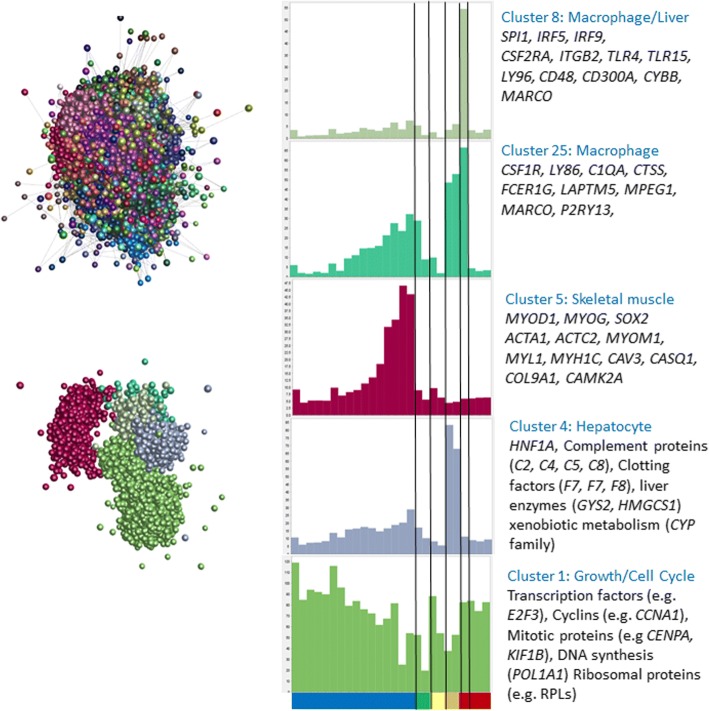
Fig. 5.
The panel on the left shows the clustered nodes for the main element in the layout graph (upper section). Nodes allocated to the same cluster are the same colour. The panel on the right shows the average expression profiles for five clusters highlighting the different phases of chick embryo development, and key genes for each cluster are shown in the boxes. The layout of these clusters within the main element is shown in the lower part of the left panel. Node colour matches the colour of the bars on the histograms. The X-axis shows the different samples (blue – embryo developmental time course from 1.5 h to day 20 after fertilisation (HH45); green – extraembryonic tissues; yellow – limb buds; orange – hepatocytes; red – bone marrow derived mesenchymal stem cells; dark red – aortic smooth muscle cells. Full details of each sample can be found in Lizio, et al. [53]. Y axis shows average tagsPM for transcription start sites in the cluster for each sample

