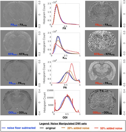
Figure 7.

Effects of modeling DWI data after signal transformation (blue) and added noise (orange, 20%; red, 50%) were compared with modeling of the original DWI dataset (black) across anisotropy metrics from DTI, DKI, MAP‐MRI, and NODDI. Whole brain histograms report the distribution of each metric generated from datasets, and difference maps are shown to compare and localize metric value changes due to noise manipulation.
