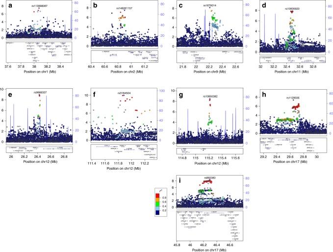
Fig. 2.
Regional association plots for the nine novel endometrial cancer loci. –log10(p) from the fixed-effects meta-analysis is on the left y axis, recombination rate (cM/Mb) is on the right y axis (plotted as blue lines). The color of the circles shows the level of linkage disequilibrium between each variant and the most significantly associated variant (purple diamond) (r2 from the 1000 Genomes 2014 EUR reference panel—see key). Genes in the region are shown beneath each plot. a 1p34.3, b 2p16.1, c 9p21.3, d 11p13, e 12p12.1, f 12q24.11, g 12q24.21, h 17q11.2, i 17q21.32

