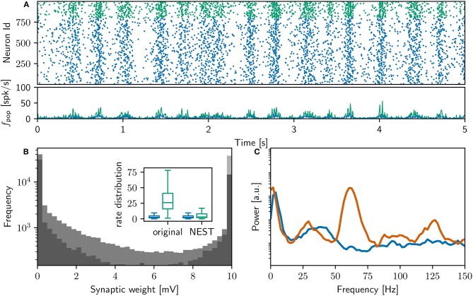
Figure 2.
Comparison of initial NEST network model with original. (A) Spike raster plot and rate envelope generated by the NEST simulation in the final 10 s (17, 990−18, 000) for inhibitory (green) and excitatory (blue) neurons. (B) Final weight distribution (frequency plotted on a logarithmic scale) for the original (dark gray) and NEST (light gray) simulations. Inset: rate distributions over the final 10 s displayed as box plots for the excitatory and inhibitory populations in the original and NEST simulations, colors as above. (C) Power spectrum of the rate envelope over the final 10 s for the excitatory population in the original (orange curve) and NEST (blue curve) simulations.

