Figure 1.
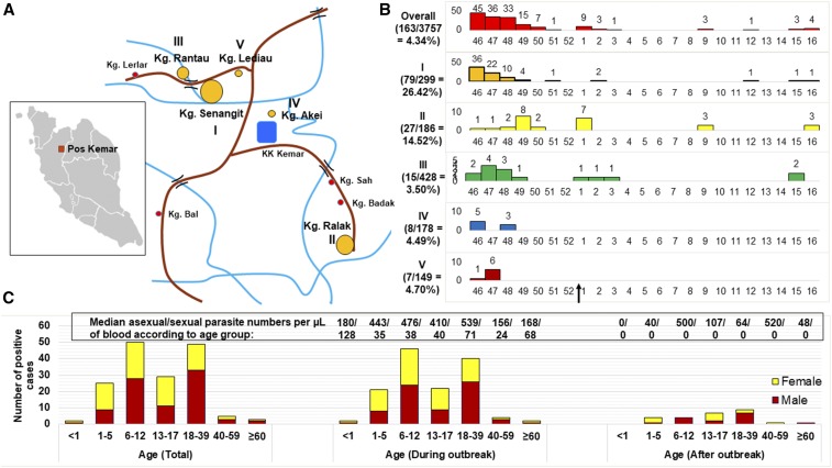
Demographic data of the outbreak. (A) Map of the Pos Kemar Orang Asli settlement showing the location of the five villages (I–V) with the highest number of cases. The size of the orange circles (big to small) next to the roman numerals denotes the relative number of cases (descending order). (B) Graphs showing the number of cases diagnosed in each week of the year from November 16, 2016 to April 20, 2017 in the five villages (I–V). The attack rate in percentage (number of cases/number of population) is shown on the left of each graph. The arrow on the x-axis at the bottom denotes the end of the outbreak. (C) Breakdown of the cases into age and gender. The bar chart on the left shows the total number of cases from November 16, 2016 to April 20, 2017, whereas the remaining graphs show the total number of cases during and after the outbreak period until April 20, 2017, respectively. The numbers above the bars denote the median asexual parasite number/sexual parasite number per microliters of blood. I: Kampung (Kg.) Senangit; II: Kg. Ralak; III: Kg. Rantau; IV: Kg. Akei; and V: Kg. Lediau. This figure appears in color at www.ajtmh.org.

