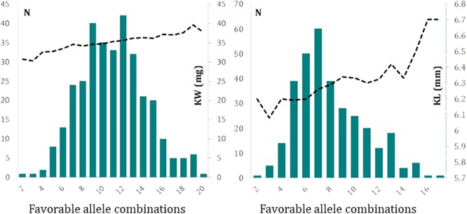
FIGURE 5.

The frequency distribution of combinations of favorable alleles with their cumulative effects on determination of kernel weight (Left) and kernel length (Right). The data used to produce these graphs are based on 2-year BLUP values. The left y-axis of each graph represents the frequency of lines and the right y-axis of graphs represent kernel weight in mg (Left) and kernel length in mm (Right).
