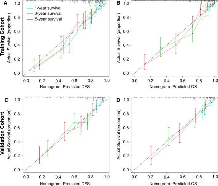
Figure 5.

Calibration Curves for the Nomogram. The calibration curve for predicting patient DFS (A, C) and OS (B, D) at 1, 3, and 5 years in the training and validation cohorts. Nomogram‐predicted OS and DFS are plotted on the x‐axis, and actual OS and DFS are plotted on the y‐axis. The dotted line represents an ideal nomogram, and the solid line represents the current nomogram. The vertical bars represent 95% CIs, and the × symbols represent bootstrap‐corrected estimates
