
Figure 7.
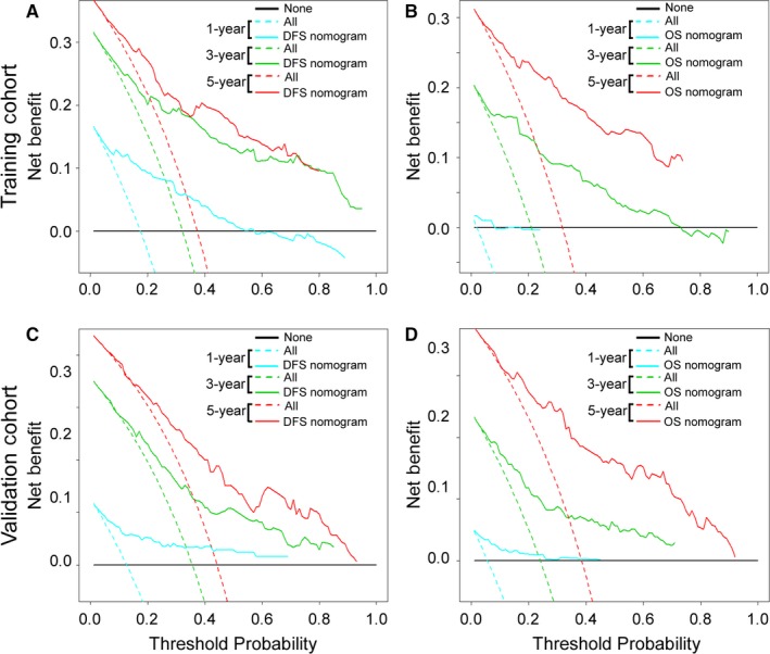
Decision Curve Analysis for the Two Nomograms in the Training and Validation Cohorts. The y‐axis measures the net benefit. The solid lines (yellow, blue and red) represent the nomogram. The dotted lines (blue, green and red) represent the assumption that all patients have 1‐, 3‐, or 5‐year survival, respectively. The thin black line represents the assumption that no patients have 1‐, 3‐, or 5‐year survival. The net benefit was calculated by subtracting the proportion of all patients who are false‐positive from the proportion who are true‐positive, weighted by the relative harm of forgoing treatment compared with the negative consequences of an unnecessary treatment.38, 39 (A, C): DFS nomogram. (B, D): OS nomogram