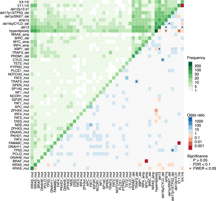
Fig. 5.
Pairwise association between variables: Heatmap showing pairwise analysis of occurrence of the most frequent genomic events in MM. The same variable is plotted in the X and Y axis, and the intensity of color in the leading diagonal indicated the frequency of the variable in the dataset. In the upper triangle, intensity of green indicates the frequency of co-occurrence of any two variables. In the lower triangle, associations are colored by odds ratio: non-significant ones are in gray, while significant ones are in blue if co-occurring, and red if mutually exclusive (p-value < 0.05, fisher test corrected for multiple hypothesis testing). Events with false-discovery rate <0.1 are marked with a dot and events with family-wise error rate <0.05 are marked with a star. While only 47 variables are shown, statistical significance is computed on the full dataset of 192 variables shown in Supplementary Figure 10

