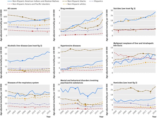
Fig 2.
Age adjusted all cause and cause specific mortality rates in US adults aged 25-64 years (midlife), 1999-2016, by race-ethnicity. Nadir (N) represents mortality rate that was statistically significantly below that of 2016. Solid circles denote joinpoints—points of inflection when mortality trend lines (not shown) changed significantly (P<0.05). See supplemental file for trend lines and larger renditions of each graph

