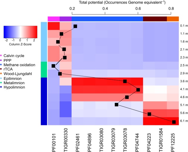
FIG 5 .
Heat map visualizing the abundances of Pfam/TIGRFAM markers (as given in Z-score standardized per genome equivalent) related to carbon fixation and the total abundance of these genes in the data set as a sum of the average abundances of the markers for each pathway, respectively. Only those Pfams/TIGRFAMs that had significantly different abundances between different layers of the lake are displayed. Colors at the top of each of the columns reflect the function that the marker represents, and colors on the left side of the heat map illustrate different layers of the lake.

