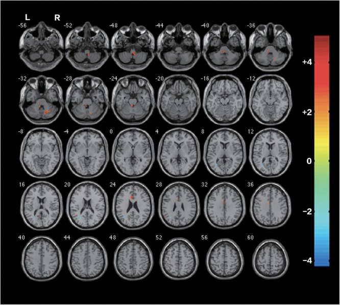
FIGURE 3.

Differences of FA between the rTMS treatment group and the sham after the rTMS (two-sample t-test, P < 0.05, AlphaSim Corrected, cluster size ≥ 83 voxels). The warm-toned areas represent the regions with increased FA, while the cool-toned ones represent the regions which have decreased FA. Changes of brain regions were projected onto an anatomical template (single T1). The right side of the images refers to the ipsilesional hemisphere.
