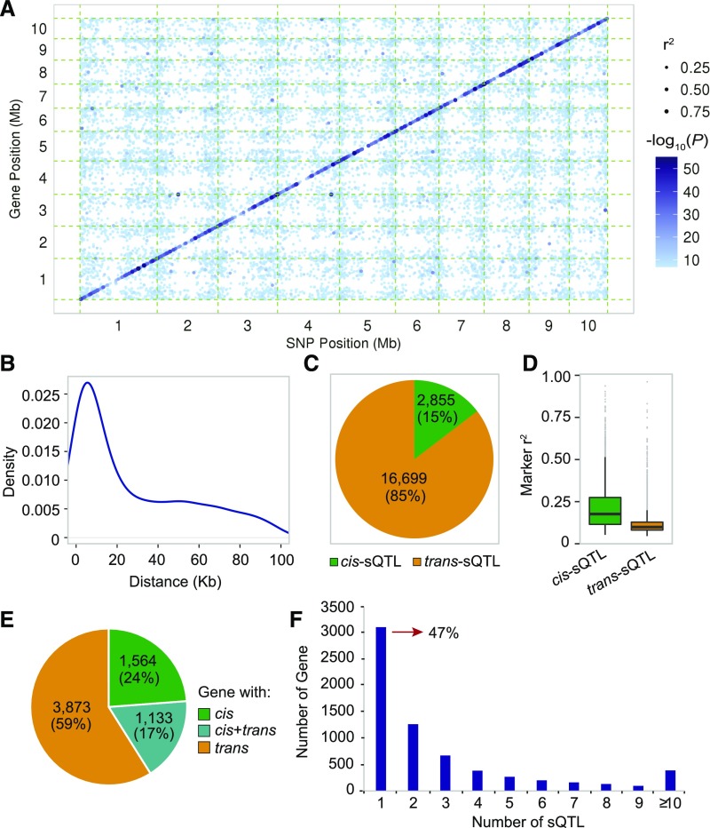
Figure 2.
sQTL Mapping.
(A) sQTL heat map. The x axis and y axis indicate the physical position of the lead SNP of the sQTL and its associated gene, respectively. Each dot represents a sQTL. Splicing variation explained by sQTLs (r2) is shown in gradual dot size, and the P value of sQTLs is shown in gradual colors.
(B) The density of distance between sQTLs and their regulated gene.
(C) The distribution of cis- and trans-sQTLs.
(D) The distribution of splicing variation explained by sQTLs (r2). Cis-sQTLs explained more splicing variation than trans-sQTLs.
(E) The distribution of genes regulated by cis- and/or trans-sQTLs.
(F) Number of sQTLs identified for each gene. The x axis and y axis represent the number of sQTLs identified for each gene and the number of genes in each group, respectively. “47%” indicates the proportion of genes detected with a single sQTL.

