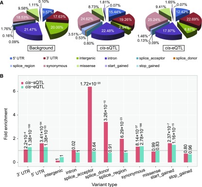
Figure 9.
Characterization of the SNP Effect.
(A) Pie charts indicating proportions of SNPs annotated with each functional category.
(B) Relative enrichment of cis-sQTLs and cis-eQTLs in each functional category. The x axis shows different types of variants. The y axis indicates the fold enrichment of cis-sQTLs and cis-eQTLs in each variant relative to the background SNPs. P values were calculated using a hypergeometric test.

