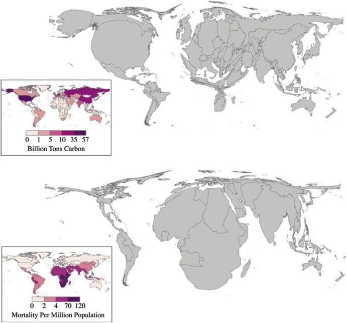
Figure 6.
Cartograms: CO2 emissions and health. Cartogram comparison of undepleted cumulative carbon dioxide (CO2) emissions (by country) for 1950 to 2000 (upper map) versus the regional distribution of 4 climate-sensitive health effects (malaria, malnutrition, diarrhea, and inland flood-related fatalities) (lower map). This is only a partial list of potential health outcomes, and there are significant uncertainties in all the underlying models. These estimates should therefore be considered a conservative, approximate estimate of the health burden of climate change. Note: CO2 emissions data from Marland, Boden, and Andres,103 adjusted for changing boundaries between 1950 and 2000, Health impacts from McMichael et al.98,104

