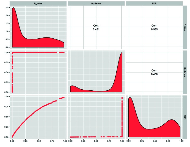
Fig.1.
Comparison of the two multiple testing adjustment methods in a matrix plot. The distribution of 500 random P values before and after adjustment is represented on the diagonal. The upper and lower triangles show the pairwise correlation coefficients and scatter plot between raw and adjusted P values respectively.

