Abstract
Purpose
People with macular degeneration (MD) experience difficulties in reading due to central-field loss. Two new fonts, Eido and Maxular Rx, have been designed specifically for individuals with MD. We have compared reading performance of these new fonts with three mainstream fonts (Times-Roman, Courier, and Helvetica).
Methods
Subjects with MD (n = 19) and normally sighted subjects (n = 40) were tested with digital versions of the MNREAD test using the five fonts. Maximum reading speed (MRS), critical print size (CPS), and reading acuity (RA) were estimated to characterize reading performance. Physical properties of the fonts were quantified by interletter spacing and perimetric complexity.
Results
Reading with MD showed font differences in MRS, CPS, and RA. Compared with Helvetica and Times, Maxular Rx permitted both smaller CPS and RA, and Eido permitted smaller RA. However, the two new fonts presented no advantage over Courier. Spacing, but not Complexity, was a significant predictor of reading performance for subjects with MD.
Conclusions
The two fonts, designed specifically for MD, permit smaller print to be read, but provide no advantage over Courier.
Keywords: macular degeneration, font, reading
Reading is one of the most important visual functions in daily life. For low-vision individuals, reading is usually slow and effortful.1–4 Special lighting, high-contrast text, large print, and magnifiers are commonly used to help with reading.5 In addition, principles of font design may enhance the accessibility of reading materials.5–8
Font design might be especially relevant to those with macular degeneration (MD) who have lost their central vision and who must use their peripheral vision to read.3,9 The severe reading deficits experienced by individuals with MD may be in part due to impaired letter and word recognition in peripheral vision.10,11 Following this reasoning, improving letter and word recognition in peripheral vision might improve reading. There is evidence showing that alternating contrast polarity of letters can improve letter recognition in peripheral vision.12 Despite this improvement in letter recognition, reading speed in a Rapid Serial Visual Presentation task did not increase. But it remains possible that font design might enhance other aspects of reading, especially reading acuity (RA) and critical print size (CPS). Within the scope of font design, appropriate modifications of interletter spacing and character shapes may be potentially beneficial for peripheral letter and word recognition.
Few studies have focused specifically on fonts for reading with MD, but see Mansfield et al.8 and Tarita-Nistor et al.13 There have been more broadly focused studies of the effects of several font properties on reading in normal and low vision, including the presence or absence of serifs,14–16 the width of strokes,17 interletter spacing (the space between letters),18,19 and others (see Russell-Minda et al.5 and Legge6 for reviews). There continues to be an interest in designing fonts that will enhance low-vision reading. Several fonts (e.g., APHont, Tiresias) have been designed and recommended exclusively for low-vision readers,20,21 but there is no clear evidence showing advantages of these special fonts over mainstream fonts for individuals with cataract and glaucoma.22 Nevertheless, considering the use of peripheral vision by individuals with MD, it remains possible that special font features may enhance reading with MD.
Two new fonts, Eido23 and Maxular Rx,24 both illustrated in Figure 1, were recently designed particularly for individuals with MD. Eido was built with the principles of emphasizing shape differences between letters and reducing visual complexity of the letters. When normally sighted subjects were required to read with their peripheral vision by a simulated central scotoma, Eido yielded significantly better flanked-letter and single-word recognition but showed no significant benefit in reading speed compared with mainstream fonts.23 Maxular Rx was designed to be very bold, have an extreme x-height, and eliminate sharp angles. The rounded serifs are intended to aid in recognition of the terminals and direction of line of reading. Maxular Rx uses extra spacing between letters and between lines to reduce crowding. Slight distortions of weight and proportion were used in the “a,” “e,” and “s” to increase the recognition of the counters (the internal spaces of those letters).24
Figure 1.
Demonstration of the five fonts used in the current study. One MNREAD sentence is rendered with each of the five fonts; x-height and leading are matched. The dashed lines were not presented in testing.
The purpose of the current study was to determine whether these two new fonts would indeed show advantages over other fonts for people with MD. Reading performance of subjects with MD and subjects with normal vision were measured with digital versions of the MNREAD test presented with Eido and Maxular Rx, and compared with performance on three mainstream fonts: Times-Roman, Courier, and Helvetica (Fig. 1).
Methods
Subjects
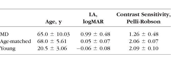
Fifty-nine subjects participated in this study; all were native English speakers with no known nonvisual reading disabilities. Normal cognitive status was verified by the Mini-Mental State Examination.25 Nineteen of the subjects had a diagnosis of MD. Subjects were recruited from our laboratory's roster of previous low-vision participants and from Vision Loss Resources (Minneapolis, MN, USA). Thirteen had dry AMD, five had wet AMD, and one had a juvenile onset form of MD. They had no additional types of eye diseases, such as cataract or glaucoma, at testing. They were all able to read visually but showed difficulties in reading. There were 14 normally sighted age-matched subjects recruited from the Retirees Volunteer Center at the University of Minnesota. There were 26 normally sighted young subjects recruited from the University of Minnesota. Group characteristics are listed in Table 1.
Table 1.
Age, LA, and Contrast Sensitivity (Mean ± SD) of the MD, Age-Matched Control, and Young Control Groups
This study was approved by the University of Minnesota Institutional Review Board and followed the Declaration of Helsinki. Consent forms were acquired from all subjects before their participation in this study.
Apparatus and Stimuli
Stimulus sentences for the MNREAD task were displayed using Psychtoolbox 3.0 software26 installed on a 17-inch MacBook Pro laptop computer (refresh rate = 60 Hz, resolution = 1680 × 1050 pixels) (Apple, Inc., Cupertino, CA, USA).
Sentences were presented as black letters (luminance = 1.9 cd/m2) on a white background (luminance = 298.5 cd/m2). Five fonts were used: the two newly developed fonts, Eido and Maxular Rx, and three mainstream fonts: Times-Roman, Courier, and Helvetica (Fig. 1). Letter size was defined as x-height (the height of lower case “x”),27,28 and angular print size was designated by x-height in logMAR. Interletter spacing (Spacing)18,29 and perimetric complexity (Complexity)30,31 were calculated to quantify the difference between these fonts (shown in Table 2).
Table 2.
Values of Spacing* and Complexity† for the Five Fonts (Means ± SD)
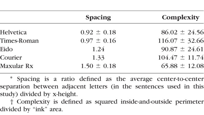
We define Spacing as the ratio of the average center-to-center separation between adjacent letters in the font, divided by the font's x-height.29 Assuming a font's properties scale with print size, Spacing has a single, characteristic value for a given font. A high value for Spacing implies wider print. Because Courier and Eido are mono-spaced fonts with fixed center-to-center spacing, Spacing can be easily calculated as the center-to-center spacing between any pair of adjacent letters divided by x-height. Because Times-Roman, Helvetica, and Maxular Rx are proportionally spaced fonts with variable character widths, a center-to-center spacing must be computed.
Complexity is defined as squared inside-and-outside perimeter divided by ‘‘ink'' area.30,31 Here we used an established algorithm from previous studies to calculate the Complexity, in which the letter perimeter was computed by an edge detection function in MATLAB (MathWorks, Natick, MA, USA) and the “ink” area was the total of nonzero pixels.32 A high value of Complexity suggests more complex print.
Procedure
All tests were conducted binocularly with subjects wearing their current reading glasses, if any. A brief vision screening was conducted first to ensure subjects' eligibility for participation. Near letter acuity (LA) was measured with the Lighthouse Near acuity chart,33 and letter contrast sensitivity was measured with the Pelli-Robson contrast sensitivity chart.34,35 Group averages and standard deviations of LA and contrast sensitivity are listed in Table 1. Before data collection, subjects practiced reading from the computer display by reading a paragraph from Alice in Wonderland in each of the five fonts.
MNREAD Test
Reading performance was evaluated with the MNREAD test.36 Unlike the chart-based test, the MNREAD sentences were rendered on a computer display to allow for flexible control of font and print size. A digital version of the MNREAD test, running on an iPad, has been shown to yield similar results with the printed MNREAD chart.37
The sentences used in the current study were selected from the 116,000 sentences generated by an algorithmic sentence generator that follows the MNREAD language, length, and layout constraints (Mansfield and Lewis. IOVS 2017;58:ARVO E-Abstract 3275). Sentences were chosen that, in addition to fitting the MNREAD formatting constraints for the Times font, also fit the MNREAD formatting constraints for Helvetica, Courier, Maxular, and Eido. This allowed for comparisons of reading performance across different fonts using identical sentences.
Each font was tested with 14 sentences. Leading (the separation between lines) was set to 2.57 × x-height for each font to avoid overlap between lines (Fig. 1). The testing procedure followed the standard MNREAD protocol.36 For the age-matched control group and the young control group, viewing distance was set at 40 cm for print sizes from 0.9 logMAR to 0.3 logMAR, and changed to 100 cm for print sizes from 0.2 logMAR to −0.4 logMAR to ensure adequate pixel resolution of letters. Nine of the subjects with MD were tested at a viewing distance of 40 cm, and the print sizes ranged from 1.1 logMAR to −0.2 logMAR. Others with lower acuities were tested at shorter viewing distances, based on their preferences. The logMAR print sizes were corrected for viewing distance. The ordering of fonts was randomized across subjects.
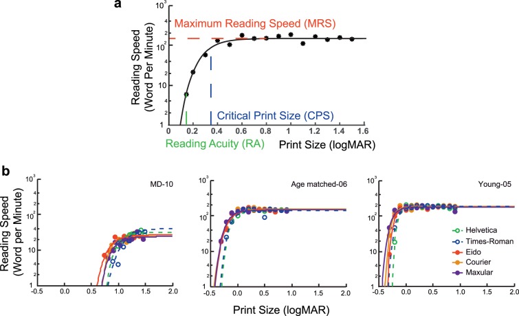
Reading speeds (in log word per minute [log wpm]) were obtained at tested print sizes. Reading-speed versus print-size curves were fitted by an exponential function (Fig. 2a):
 |
where y is log reading speed, mrs is the maximum reading speed (MRS), x is print size, lrc is the rate of change in reading speed, and xint is the print size at which reading speed is 0 log wpm.
Figure 2.
MNREAD curves. (a) A standard MNREAD curve. The curve is fitted by an exponential function. MRS, CPS, and RA were used to quantify reading performance. (b) Examples of MNREAD curves for individual subjects in the MD group (left), age-matched control group (middle), and young control group (right).
Variation between subjects was taken into account as a random effect using a nonlinear mixed-effects (NLME) model.38 Reading curves from 14 subjects in the MD group were fitted by the NLME model. Another five subjects showed unreliable curve fitting and were thus fitted individually. Three parameters were obtained as indices of reading performance (Fig. 2a):
MRS: the fastest reading speed subjects can achieve without any constraint of print size, and calculated as the plateau of the fitted exponential curve.
CPS: the smallest print size yielding best reading speed, and calculated as the print size corresponding to a reading speed of 95% of MRS.
RA: the smallest print size that can just be read, and calculated as below:
 |
Data Analysis
MRS, CPS, and RA were compared across fonts for each group. The main statistical analysis (unless otherwise specified) was a repeated measures ANOVA, with font types as the within subject factor. Significant main effects were followed by post hoc analysis with Bonferroni adjustment. Linear mixed effect models (LME) were then performed to clarify the contributions of Spacing and Complexity to the font effects, specifically, Spacing and Complexity were entered into the model as fixed-effect factors, and subject was entered as a random-effect factor.
Results
Font Effects on MNREAD Performance
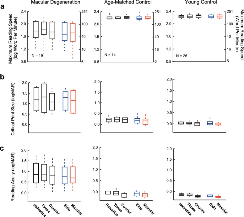
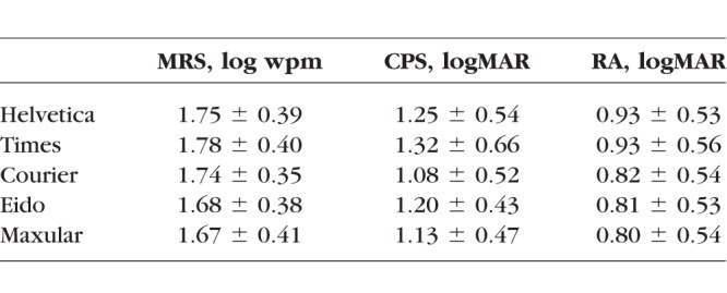
MRS, CPS, and RA were obtained for each font from each subject (Fig. 2b). Distributions of MRS, CPS, and RA in the three subject groups are shown in Figure 3. For the MD group, means and SDs of these values are given in Table 3.
Figure 3.
Distributions of MRS (a), CPS (b), and RA (c) for the five fonts in MD (left panels), age-matched control (middle panels), and young control (right panels) groups. Each quantile box plot shows the 90th, 75th, 50th (median), 25th, and 10th percentiles.
Table 3.
Values of MRS, CPS, and RA for the Five Fonts in the MD Group (Means ± SD)
Maximum Reading Speed
There was no effect of font on MRS for either of the two control groups. The font effect was significant only for the MD group (F4,72 = 2.74, P = 0.035). For the MD group, the fastest MRS was achieved with Times (60 wpm) and the slowest with Maxular Rx (47 wpm). However, none of the post hoc pairwise comparisons reached significance.
Critical Print Size
The font effect was significant only for the MD group (F4,72 = 6.56, P < 0.001). Courier had the smallest mean CPS (1.08 logMAR), and Times had the largest CPS (1.32 logMAR). Post hoc analysis showed a significant difference between Courier and Helvetica (P = 0.003); there were also significant differences between Maxular Rx and Helvetica (P = 0.025) and Times (P = 0.031).
Reading Acuity
There were significant font effects for all three groups (MD group: F4,72 = 28.99, P < 0.001; age-matched control: F4,52 = 26.34, P < 0.001; young control: F4,100 = 65.94, P < 0.001). For all three groups, Maxular Rx had the best RA, and Helvetica had the worst RA. The difference between Maxular Rx and Helvetica reached 0.13 logMAR (more than one line on the eye chart) in the MD group. Pairwise comparisons showed that for the MD group, Eido and Maxular Rx both had significantly better RA than Helvetica (both P < 0.001) and Times (both P < 0.001), but not Courier. The age-matched control and young control groups showed similar results to the MD group, except that Maxular Rx also had an advantage over Courier by 0.03 logMAR in the young control group (P = 0.004).
A comparison of RA and LA showed that for the MD group, RA was significantly better than LA for Courier (P = 0.001), Eido (P < 0.001), and Maxular Rx (P < 0.001), but not for Helvetica and Times. However, for the age-matched and young control groups, RA was significantly better than LA for all five fonts (P < 0.005). The difference ranged from a maximum of 0.20 logMAR for Maxular Rx in the young control group to a minimum of 0.07 logMAR for Helvetica in the age-matched control group.
Impact of Spacing and Complexity
We used LME models to explore the contributions of Complexity and Spacing to the font effects.
Complexity did not contribute significantly to any of the estimates for the MD group. It had minor but statistically significant effects for the age-matched and young control groups. According to the LME models, the complexity difference across the five fonts (complexity range from 65.88 to 116.07) would induce a difference in RA by 0.035 logMAR in the age-matched control group, and by 0.015 logMAR in the young control group (Table 4).
Table 4.
Linear Mixed-Effects Models of RA in Age-Matched Control and Young Control Groups
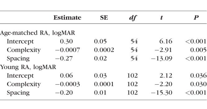
Spacing was a significant predictor of MRS, CPS, and RA in the MD group. The results demonstrate an interesting trade-off: an increase in Spacing was associated with slower MRS, but better CPS and RA. For the MD group, the Spacing difference across the five fonts (Spacing range from 0.92 to 1.50) changed MRS by 0.08 log wpm (equivalent to a 19% change in reading speed) (Fig. 4a), and changed CPS by 0.19 logMAR (Fig. 4b) and RA by 0.14 logMAR (Fig. 4c). Spacing was also a significant predictor of RA for both age-matched and young control groups, the Spacing difference across the five fonts changed RA by 0.16 logMAR in the age-matched group, and by 0.12 logMAR in the young control group (Table 4).
Figure 4.
Linear mixed-effects models of MRS (a), CPS (b), and RA (c) in the MD group. Group averages across the five fonts are plotted against Spacing, as well as the regression lines.
This analysis revealed a substantial role of Spacing in reading. Further insight comes from comparing reading performance between fonts with the same complexity but different Spacing. All subjects were tested with an additional reading condition: another version of Eido (Eido-Narrow) created by the same designer, which had the same set of characters but a narrower Spacing (0.98) compared with 1.24 for the version of Eido tested in the main experiment. MRS, CPS, and RA were compared between Eido and Eido-Narrow in all three groups, individual data are shown in Figure 5. For the MD group, Eido-Narrow yielded faster MRS by 0.07 log wpm (18%, P = 0.019, Fig. 5a), marginally significantly larger CPS by 0.14 logMAR (P = 0.063, Fig. 5b), and significantly larger RA by 0.09 logMAR (P = 0.001, Fig. 5c). These results confirm the findings across fonts, showing that narrower Spacing induced faster MRS but larger CPS and RA for the MD group.
Figure 5.
MRS (a), CPS (b), and RA (c) of two versions of Eido with different Spacing. Circles of different colors represent different subject groups (MD: red; age-matched control: blue; young control: green).
There were no significant differences for the age-matched control group between the two versions of Eido. Eido-Narrow had a small, but significantly larger RA by 0.05 logMAR (P < 0.001) for the young control group.
Discussion
The current study compared reading performance of text rendered with five different fonts. Two of them, Eido and Maxular Rx, were designed specifically for readers with MD. The other three, Helvetica, Times, and Courier, are widely used fonts. For subjects with MD, significant font differences were observed for MRS, CPS, and RA. Compared with Helvetica and Times, Maxular Rx permitted both smaller CPS and RA, and Eido permitted smaller RA. However, the two new fonts did not present any advantage over Courier. Font variations had less influence on the reading performance of normally sighted subjects, affecting only RA.
We investigated the influence on reading performance of two physical properties that distinguish fonts: interletter spacing (Spacing) and perimetric complexity (Complexity).
Perimetric complexity is readily computable and depicts the “dispersion” of characters30 and indicates how convoluted the characters are.31 It has been shown to have a high correlation with other measurements of complexity (e.g., ink density and skeleton length).32,39 Complexity was not a significant predictor of reading performance for subjects with MD, but it had a small but significant effect on RA for both normally sighted groups; higher values of complexity were associated with better acuity (smaller values of logMAR RA). This result is consistent with a previous study showing that higher complexity induced better recognition of flanked letters, possibly because more complex targets have more features to compete with flankers.40 However, another study found that the acuity size of Chinese characters increased with complexity (defined as the stroke frequency).41 One possible explanation for this discrepancy is that higher complexity resulted in larger crowding between components within Chinese characters.
Spacing was found to be a significant predictor for the MRS, CPS, and RA of the MD group. Recall that we define Spacing relative to the size of characters (specifically, relative to x-height), so this property of a font is independent of overall print size. Fonts with larger Spacing had smaller CPS and RA, that is, could be read with smaller characters. It is likely that this effect is due to reduced crowding in the fonts with larger Spacing. Crowding refers to interference with letter recognition by adjacent letters. It is known that crowding contributes to reading difficulty in peripheral vision42,43 and can be alleviated by increasing the Spacing between letters.10,23,43–45 For our age-matched and young control groups, RA was better than LA for all five fonts. This advantage of RA over LA is consistent with previous findings.46,47 It may be due to a context benefit from meaningful sentence reading. However, for the MD group, this effect was absent with Helvetica and Times, possibly because the context benefit was offset by strong crowding in these fonts with smaller Spacing.
Although enhanced Spacing within a font contributes to an ability to read tinier letters, there is a trade-off. The LME model indicated slower MRS for fonts with greater Spacing. This means that the fonts that were most legible for the tiniest print were read more slowly for big print. This trade-off was more prominent for Eido and Maxular Rx than for Courier (Table 3). One possible reason for this difference is that the subjects had more reading experience with the mainstream font Courier. It is also possible that Courier has some attributes that can compensate for this trade-off. Previous studies have compared reading performance with Courier and Times in individuals with low vision.8,13 Our finding that Courier yields a smaller CPS and RA is consistent with these studies. However, Mansfield et al.8 report a faster MRS for Courier than Times, whereas Tarita-Nistor et al.13 and the current study report no MRS difference between Times and Courier. A meta-analysis that combines the findings from these three studies shows a weak (0.006 log wpm, 1%) MRS advantage for Courier over Times, but this difference is not significant (P = 0.83, 95% confidence interval −0.044 to 0.055). Differences in the characteristics of the MD samples across the three studies might contribute to the discrepancies; binocular visual acuities for the three samples were as follows: 0.85 ± 0.35 logMAR (Snellen 20/148)8; 0.47 ± 0.19 logMAR (Snellen 20/59)13; and 0.99 ± 0.48 logMAR (Snellen 20/200) in the current study.
A salient property of Eido is its unfamiliarity. In a pilot study in which six normally sighted young subjects were briefly trained on the new fonts (26 sentences each), no significant improvement was found. However, whether more extensive training on unfamiliar fonts like Eido would yield better performance could be explored in future studies. A salient property of Maxular Rx is its boldness. In a previous study, Bernard et al.17 measured reading speed as a function of stroke boldness for Courier text. They found that reading speed was invariant over a wide range of boldness, and decreased when gaps within letters or space between letters grew too small. However, Maxular Rx was designed with sufficient spacing between letters to mitigate any detrimental effects of increased boldness.
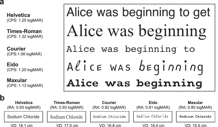
What font is best for readers with MD? To answer this question, the reader's goal task, magnification requirement, and display size should all be taken into consideration. When reading a lengthy text passage, readers would want to increase the letter size to at least CPS to achieve fluent reading. The number of characters that will fit on a line will depend jointly on the font's CPS, the font Spacing, and the display size. The best font should allow the most words in one line. Spot reading48 is another common challenge for readers with MD when small print is used to squeeze a lot of important information into a small text area (e.g., price tags or medicine labels). The best font would allow the text to be read at the greatest viewing distance. Examples of an imaginary MD reader performing lengthy text reading and spot reading are shown in Figure 6.
Figure 6.
Real-life examples of an imaginary MD reader who has the same vision and reading parameters as the average of the MD group. (a) The imaginary MD reader reading Alice in Wonderland presented on a 9.4-inch iPad screen from 40 cm. A line is rendered in the five fonts at the estimated CPS (shown under each font name) from our MD group data. The number of words per line would then be determined by the length of each word in the text. For this subject, Helvetica might be the best font for reading lengthy passages because it allows the most words in one line and also yields slightly faster reading speed than most of the other fonts. (b) The imaginary MD reader reading a medicine label (3.17 cm * 1.00 cm). The label content is rendered in the five fonts at the largest possible letter sizes for each font, the estimated viewing distances (VD) to achieve RA are shown below each label. The label can be read at a slightly greater distance for Eido, but the overall range of acuity distances is very small for our set of five fonts.
How general are our results? Although the designers of the two new fonts intended their designs to be helpful for anyone with MD, it is possible that the design features might be more helpful for people with specific clinical characteristics. In our current study we did not attempt to relate the font benefits to scotoma shape or size or the properties of preferred retinal loci. A more extensive study would be required to assess these relationships. Similarly, we focused on reading with high-contrast text. MD patients with low-contrast sensitivity might be more susceptible to low-contrast text and might benefit more from a bolder font such as Maxular Rx. For readers with very low acuity, it may sometimes be particularly important to extend the range of legible print to smaller size. Magnifiers can help with small print reading, but in situations in which magnifiers are not available or convenient for reading, fonts that yield better RA, such as Eido, Maxular Rx, and Courier, may be beneficial. A further study, taking into account the use of magnifiers, might shed more light on the merits of different fonts for MD reading.
Digital displays make it much easier to manipulate text properties (e.g., font type and size). Our results emphasized the importance of making Spacing, as a ratio of letter size, an adjustable property for digitized texts. Digital displays also make it possible to explore other stimulus dimensions for encoding alphabetic information. For example, Bragg et al.49 recently introduced a font for low vision based on variations in color and temporal animation. Perhaps the ingenuity of font designers, working with traditional font properties or unusual stimulus features, can still further enhance reading by people with MD.
Acknowledgments
The authors thank Jean-Baptiste Bernard (designer of Eido) and Steven Skaggs (designer of Maxular Rx) for sharing the new fonts, and Luminita Tarita-Nistor for sharing data.13
Supported by National Institutes of Health Grant EY002934.
Disclosure: Y.-Z. Xiong, None; E.A. Lorsung, None; J.S. Mansfield, Precision Vision (R), P; C. Bigelow, None; G.E. Legge, Precision Vision (R), P
References
- 1.Faye EE. Clinical Low-Vision. Boston, MA: Little, Brown;; 1976. [Google Scholar]
- 2.Fletcher DC, Schuchard RA, Watson G. Relative locations of macular scotomas near the PRL: effect on low vision reading. J Rehabil Res Dev. 1999;36:356–364. [PubMed] [Google Scholar]
- 3.Legge GE, Ross JA, Isenberg LM, LaMay JM. Psychophysics of reading: clinical predictors of low-vision reading speed. Invest Ophthalmol Vis Sci. 1992;33:677–687. [PubMed] [Google Scholar]
- 4.Legge GE, Rubin GS, Schleske MM. Contrast-polarity effects in low-vision reading. In: Woo GC, editor. Low Vision: Principles and Applications. New York: Springer-Verlag;; 1986. pp. 288–307. [Google Scholar]
- 5.Russell-Minda E, Jutai JW, Strong JG, et al. The legibility of typefaces for readers with low vision: a research review. J Vis Impair Blind. 2007;101:402–415. [Google Scholar]
- 6.Legge GE. Psychophysics of Reading in Normal and Low Vision. Mahwah, NJ: Lawrence Erlbaum;; 2007. Displaying text; pp. 107–166. [Google Scholar]
- 7.Arditi A. Adjustable typography: an approach to enhancing low vision text accessibility. Ergonomics. 2004;47:469–482. doi: 10.1080/0014013031000085680. [DOI] [PubMed] [Google Scholar]
- 8.Mansfield J, Legge G, Bane M. Psychophysics of reading: font effects in normal and low vision. Invest Ophthalmol Vis Sci. 1996;37:1492–1501. [PubMed] [Google Scholar]
- 9.Legge GE, Rubin GS, Pelli DG, Schleske MM. Psychophysics of reading: low vision. Vision Res. 1985;25:253–266. doi: 10.1016/0042-6989(85)90118-x. [DOI] [PubMed] [Google Scholar]
- 10.Bouma H. Interaction effects in parafoveal letter recognition. Nature. 1970;226:177–178. doi: 10.1038/226177a0. [DOI] [PubMed] [Google Scholar]
- 11.Pelli DG, Farell B, Moore DC. The remarkable inefficiency of word recognition. Nature. 2003;423:752–756. doi: 10.1038/nature01516. [DOI] [PubMed] [Google Scholar]
- 12.Chung STL, Mansfield JS. Contrast polarity differences reduce crowding but do not benefit reading performance in peripheral vision. Vision Res. 2009;49:2782–2789. doi: 10.1016/j.visres.2009.08.013. [DOI] [PMC free article] [PubMed] [Google Scholar]
- 13.Tarita-Nistor L, Lam D, Brent MH, Steinbach MJ, Gonzalez EG. Courier: a better font for reading with age-related macular degeneration. Can J Ophthalmol. 2013;48:56–62. doi: 10.1016/j.jcjo.2012.09.017. [DOI] [PubMed] [Google Scholar]
- 14.Arditi A, Cho J. Serifs and font legibility. Vision Res. 2005;45:2926–2933. doi: 10.1016/j.visres.2005.06.013. [DOI] [PMC free article] [PubMed] [Google Scholar]
- 15.Morris RA, Aquilante K, Yager D, Bigelow C. Serifs slow RSVP reading at very small sizes but don't matter at larger sizes. J Soc Inf Disp. 2002;33:244–247. [Google Scholar]
- 16.Akhmadeeva L, Tukhvatullin I, Veytsman B. Do serifs help in comprehension of printed text? An experiment with Cyrillic readers. Vision Res. 2012;65:21–24. doi: 10.1016/j.visres.2012.05.013. [DOI] [PubMed] [Google Scholar]
- 17.Bernard JB, Kumar G, Junge J, Chung STL. The effect of letter-stroke boldness on reading speed in central and peripheral vision. Vision Res. 2013;84:33–42. doi: 10.1016/j.visres.2013.03.005. [DOI] [PMC free article] [PubMed] [Google Scholar]
- 18.Arditi A, Liu L, Lynn W. Legibility of outline and solid fonts with wide and narrow spacing. In: Yager D, editor. Trends in Optics and Photonics. Vol. 11. Washington, DC: Optical Society of America; 1997. pp. 52–56. [Google Scholar]
- 19.Arditi A, Knoblauch K, Grunwald I. Reading with fixed and variable pitch. J Opt Soc Am. 1990;7:2011–2015. doi: 10.1364/josaa.7.002011. [DOI] [PubMed] [Google Scholar]
- 20.Kitchel JE. Large Print: Guidelines for Optimal Readability and APHont a Font for Low Vision. Louisville, KY: American Printing House for the Blind;; 2004. [Google Scholar]
- 21.Gill JM, Perera S. Proceedings of the 1st European Conference on Interactive Television: From Viewers to Actors. New York, NY: Association for Computing Machinery;; 2003. Accessible universal design of interactive digital television; pp. 83–89. [Google Scholar]
- 22.Rubin GS, Feely M, Perera S, Ekstrom K, Williamson E. The effect of font and line width on reading speed in people with mild to moderate vision loss. Ophthalmic Physiol Opt. 2006;26:545–554. doi: 10.1111/j.1475-1313.2006.00409.x. [DOI] [PubMed] [Google Scholar]
- 23.Bernard JB, Aguilar C, Castet E. A new font, specifically designed for peripheral vision, improves peripheral letter and word recognition, but not eye-mediated reading performance. PLoS One. 2016;11:1–25. doi: 10.1371/journal.pone.0152506. [DOI] [PMC free article] [PubMed] [Google Scholar]
- 24.University of Louisville. Letters between friends. University of Louisville Magazine. 2017;36:28–31. [Google Scholar]
- 25.Folstein MF, Folstein SE, McHugh PR. “Mini-Mental State.” A practical method for grading the cognitive state of patients for the clinician. J Psychiatr Res. 1975;12:189–198. doi: 10.1016/0022-3956(75)90026-6. [DOI] [PubMed] [Google Scholar]
- 26.Pelli DG. The VideoToolbox software for visual psychophysics: transforming numbers into movies. Spat Vis. 1997;10:437–442. [PubMed] [Google Scholar]
- 27.National Research Council Committee on Vision. Recommended standard procedures for the clinical measurement and specification of visual acuity. Adv Ophthalmol. 1980;41:103–148. [PubMed] [Google Scholar]
- 28.Legge GE, Bigelow CA. Does print size matter for reading? A review of findings from vision science and typography. J Vis. 2011;11(5):8. doi: 10.1167/11.5.8. [DOI] [PMC free article] [PubMed] [Google Scholar]
- 29.Chung STL, Tjan BS. Shift in spatial scale in identifying crowded letters. Vision Res. 2007;47:437–451. doi: 10.1016/j.visres.2006.11.012. [DOI] [PMC free article] [PubMed] [Google Scholar]
- 30.Attneave F, Arnoult MD. The quantitative study of shape and pattern perception. Psychol Bull. 1956;53:452–471. doi: 10.1037/h0044049. [DOI] [PubMed] [Google Scholar]
- 31.Pelli DG, Burns CW, Farell B, Moore-Page DC. Feature detection and letter identification. Vision Res. 2006;46:4646–4674. doi: 10.1016/j.visres.2006.04.023. [DOI] [PubMed] [Google Scholar]
- 32.Wang H, He X, Legge GE. Effect of pattern complexity on the visual span for Chinese and alphabet characters. J Vis. 2014;14(8):6. doi: 10.1167/14.8.6. [DOI] [PMC free article] [PubMed] [Google Scholar]
- 33.Ferris FL, Kassoff A, Bresnick GH, Bailey IL. New visual acuity charts for clinical research. Am J Ophthalmol. 1982;94:91–96. [PubMed] [Google Scholar]
- 34.Elliott DB, Bullimore MA, Bailey IL. Improving the reliability of the Pelli-Robson Contrast Sensitivity Test. Clinical Vision Sciences. 1991;6:471–475. [Google Scholar]
- 35.Pelli DG, Robson JG, Wilkins A. The design of a new letter chart for measuring contrast sensitivity. Clinical Vision Sciences. 1988;2:187–199. [Google Scholar]
- 36.Mansfield JS, Legge GE. The MNREAD acuity chart. In: Legge GE, editor. Psychophysics of Reading in Normal and Low Vision. Mahwah, NJ: Lawrence Erlbaum;; 2007. pp. 167–191. [Google Scholar]
- 37.Calabrèse A, To L, He Y, Berkholtz E, Rafian P, Legge GE. Comparing performance on the MNREAD iPad app with the MNREAD acuity chart. J Vis. 2018;18(1):8. doi: 10.1167/18.1.8. [DOI] [PMC free article] [PubMed] [Google Scholar]
- 38.Cheung SH, Kallie CS, Legge GE, Cheong AMY. Nonlinear mixed-effects modeling of MNREAD data. Invest Ophthalmol Vis Sci. 2008;49:828–835. doi: 10.1167/iovs.07-0555. [DOI] [PubMed] [Google Scholar]
- 39.Bernard JB, Chung STL. The dependence of crowding on flanker complexity and target-flanker similarity. J Vis. 2011;11(8):1. doi: 10.1167/11.8.1. [DOI] [PMC free article] [PubMed] [Google Scholar]
- 40.Chanceaux M, Mathot S, Grainger J. Effects of number, complexity, and familiarity of flankers on crowded letter identification. J Vis. 2014;14(6):7. doi: 10.1167/14.6.7. [DOI] [PubMed] [Google Scholar]
- 41.Zhang JY, Zhang T, Xue F, Liu L, Yu C. Legibility variations of Chinese characters and implications for visual acuity measurement in Chinese reading population. Invest Ophthalmol Vis Sci. 2007;48:2383–2390. doi: 10.1167/iovs.06-1195. [DOI] [PubMed] [Google Scholar]
- 42.He YC, Kwon MY, Legge GE. Common constraints limit Korean and English character recognition in peripheral vision. J Vis. 2018;18(1):5. doi: 10.1167/18.1.5. [DOI] [PMC free article] [PubMed] [Google Scholar]
- 43.Pelli DG, Tillman KA, Freeman J, Su M, Berger TD, Majaj NJ. Crowding and eccentricity determine reading rate. J Vis. 2007;7(2):20. doi: 10.1167/7.2.20. [DOI] [PubMed] [Google Scholar]
- 44.Levi DM. Crowding—an essential bottleneck for object recognition: a mini-review. Vision Res. 2008;48:635–654. doi: 10.1016/j.visres.2007.12.009. [DOI] [PMC free article] [PubMed] [Google Scholar]
- 45.Pelli DG, Palomare M, Majaj NJ. Crowding is unlike ordinary masking: distinguishing feature integration from detection. J Vis. 2004;4(12):12. doi: 10.1167/4.12.12. [DOI] [PubMed] [Google Scholar]
- 46.Xu R, Bradley A. IURead: a new computer-based reading test. Ophthalmic Physiol Opt. 2015;35:500–513. doi: 10.1111/opo.12233. [DOI] [PubMed] [Google Scholar]
- 47.Chung ST, Jarvis SH, Cheung SH. The effect of dioptric blur on reading performance. Vision Res. 2007;47:1584–1594. doi: 10.1016/j.visres.2007.03.007. [DOI] [PMC free article] [PubMed] [Google Scholar]
- 48.Whittaker SG, Lovie-Kitchin J. Visual requirements for reading. Optom Vis Sci. 1993;70:54–65. doi: 10.1097/00006324-199301000-00010. [DOI] [PubMed] [Google Scholar]
- 49.Bragg D, Azenkot S, Larson K, Bessemans A, Kalai AT. Proceedings of the 30th Annual ACM Symposium on User Interface Software and Technology. New York, NY: Association for Computing Machinery;; 2017. Designing and evaluating Livefonts; pp. 481–492. [Google Scholar]


