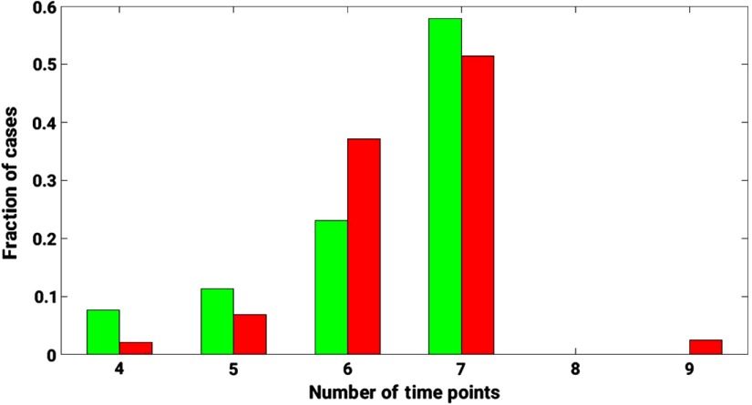
Fig. 2.
A histogram of the dynamic sequence lengths for the DCE-MRIs in the database. Green bars represent the distribution of benign cases. Red bars represent the distribution of malignant cases. The length of the dynamic sequence is plotted on the -axis. The fraction of cases relative to the total number of benign/malignant cases is plotted on the -axis.

