Figure 2.

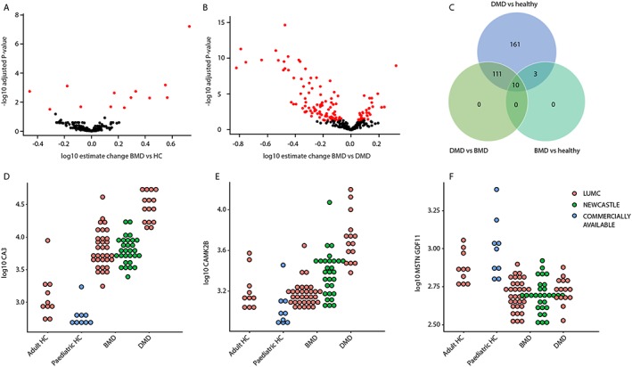
Cross‐sectional analysis of BMD patients. (A) Volcano plot showing the estimated change in BMD patients compared with healthy controls (x‐axis) and the −log10 of the adjusted P‐values. Black circles represent proteins that are not differentially represented in BMD patients compared to healthy controls, while red circles represent the 13 proteins surviving multiple testing correction. (B) Volcano plot showing the estimated change in BMD patients compared with DMD patients. Red circles represent the 121 proteins that were significant after multiple testing correction. (C) Venn diagram showing the overlap between proteins differentially expressed in the DMD, BMD, and healthy. (D–F) Dot plots showing three examples of proteins able to discriminate among DMD, BMD, and healthy (D), or discriminating between DMD and healthy but not between BMD and healthy (E), or able to discriminate between dystrophic and non‐dystrophic but unable to separate DMD and BMD (F).
