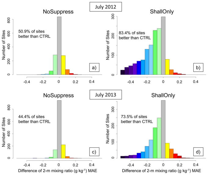
Figure 12.
Histograms of the number of sites where 2 m water vapor mixing ratio MAE is improved or degraded when compared to CTRL. The y axis is the number of sites and the x axis is the difference of the 2 m mixing ratio (g kg−1) MAE between each assimilation method and the CTRL (e.g., NoSuppress − CTRL is shown in Figures 12a and 12c) for (a,b) July 2012 and (c,d) July 2013. The left side of the grey bar centered on zero represents a performance increase compared to CTRL and the right side is a performance decrease compared to CTRL. The percentage of sites where performance was increased is also displayed for each histogram. Note that the percentages include any improvement over CTRL and therefore values in the grey bar are included in the calculation.

