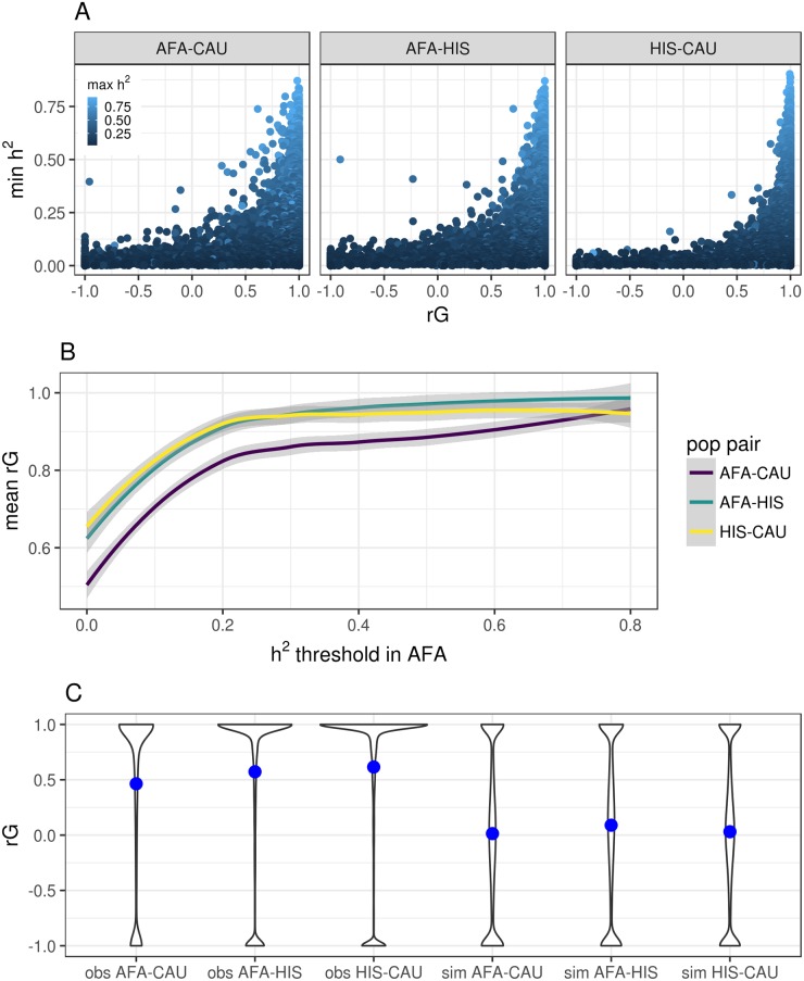
Fig 2. Genetic correlation (rG) of gene expression between MESA populations.
(A) Pairwise population comparison of heritability (h2) and rG for each gene. The y-axis is the minimum h2, the x-axis is the genetic correlation, and the points are colored according to the maximum h2 between the populations titling each plot. (B) Comparison of the genetic correlation between pairwise MESA populations and the subset of genes with h2 greater than a given threshold in the AFA population. (C) Violin plots of the observed results (obs) compared to simulated expression data (sim) with the same h2 distributions. The blue points represent the mean rG across genes for the population pair. The most correlated populations are CAU and HIS and the least correlated populations are AFA and CAU. Note more genes have an rG estimate equal to 1 in the observed data compared to the simulated data.

