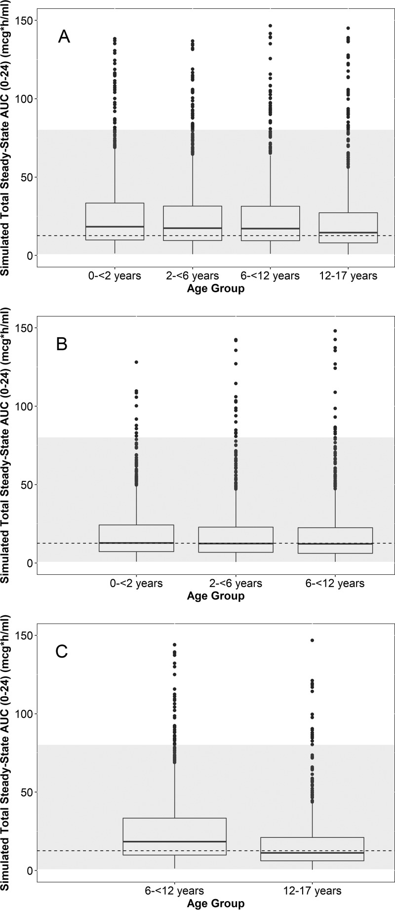
FIG 4.
Box plots of the simulated day 5 area under the concentration-versus-time curve from 0 to 24 h (AUC0–24) across age groups using 8 mg/kg i.v. daily (A) (400 mg maximum) and 20 mg/kg on day 1 (800 mg maximum) followed by 10 mg/kg on days 2 to 5 (400 mg maximum) for the suspension (B) and capsules (C). Capsule doses were rounded upwards to the nearest 200 mg. The dashed line and gray region denote the geometric mean and range of the adult exposures in the phase 3 studies, respectively. Because phase 3 adult studies evaluated daily oral dosing and an i.v.-to-oral formulation switch, the same geometric mean and range (estimates following multiple oral dosing) are visualized across all 3 panels. The dashed lines used in all panels represent the geometric mean day 4 exposure following capsule daily dosing in the phase 3 study. The lower and upper hinges of the box plot correspond to the 25th and 75th percentiles, respectively. The upper and lower whiskers extend to the largest and smallest value no further than 1.5 · interquartile range (IQR), respectively. Closed circles represent outlier values outside 1.5 · IQR. Simulated extreme outlier values of >150 μg · h/ml (1.2% and <0.5% of the simulated data points for the i.v. and oral [suspension/capsule] formulations, respectively) are not plotted for ease of visualization.

