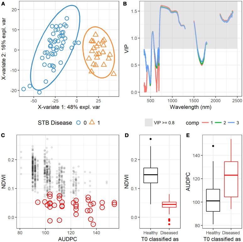
Figure 9.
(A) Scatterplot shows the observations that are projected onto the first two components of the PLSDA model, suggesting the complete separation of the two groups (0 = healthy, 1 = diseased). (B) Variable importance in projections (VIP) scores at different wavelengths projected in the first three components (comp 1, 2, and 3). (C) Scatter plot shows the relationship between NDWI and AUDPC, and red circles highlight the observations of Zymoseptoria tritici un-treated plots (T0) that were classified as diseased canopies by the PLSDA model. (D) Boxplot shows the difference in NDWI between the correctly classified and misclassified T0 plots. (E) Boxplot shows the difference in AUDPC between the correctly classified and misclassified T0 plots.

