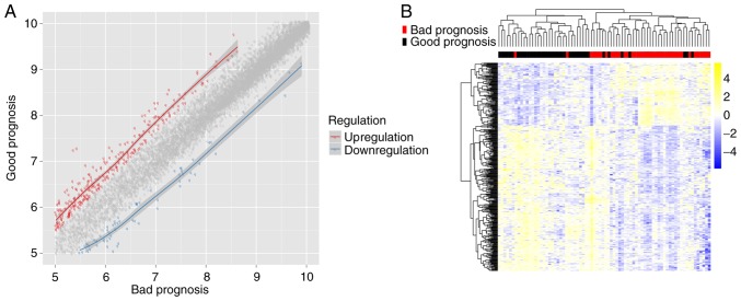
Figure 1.
Analysis of DEGs between good and bad prognosis groups. (A) Scatter plot of DEGs. Red spots represent upregulated genes in the good prognosis group; blue spots represent downregulated genes; grey spots represent the non-differentially expressed genes between good and bad prognosis groups. (B) Heatmap showing the hierarchical clustering of DEGs. DEGs, differentially expressed genes.

