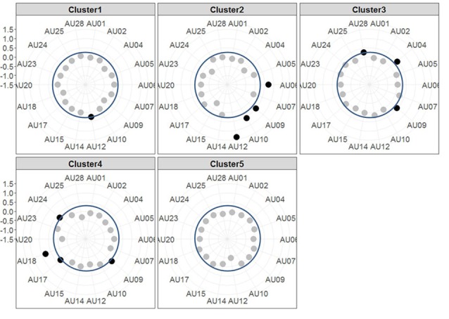
Figure 3.

Radar plots showing the results of the k-means clustering. Each plot shows the centroids of one Cluster with each axis of the radar plot referring to the evidence of one AU. The dots mark the evidence for the respective AU, i.e., the further outside they are, the higher the evidence is (the axis for evidence ranges from −1.5 to +1.5 with each gray line indicating a step of 0.5). AUs that are considered as activated (i.e., with an evidence ≥0.25, indicated by blue circle line) are printed in black, the others in gray.
