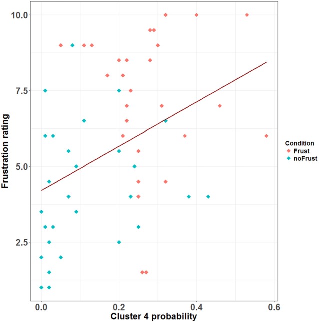
Figure 4.

Scatterplot showing the correlation between the probability (relative frequency) of Cluster 4 and the subjective frustration rating. The plot contains data from the Frust (red) and noFrust (turquoise) condition. The regression line is plotted in dark red.
