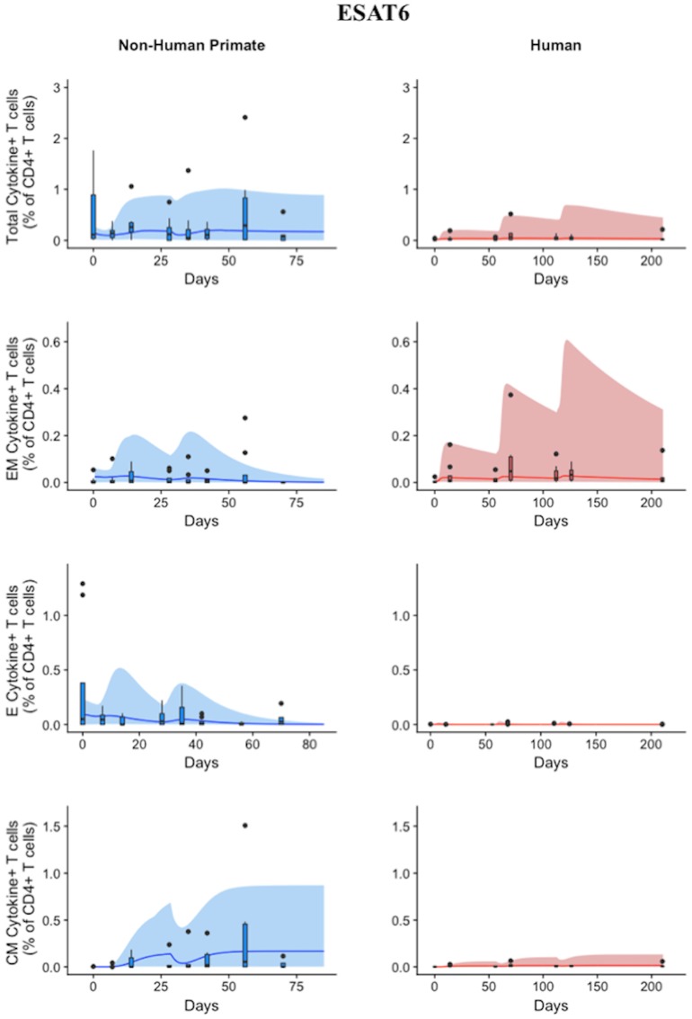
Figure 4.
Model captures diverse response of both NHP and Humans to ESAT6 antigen following H56 vaccination. The percentage of blood CD4+ T cells that respond to ESAT6 by producing cytokines (cytokine+) is divided by the total number of CD4+ T cells in the blood. T cell subtypes are also shown. Each time point shows the responses of all 8 human (red) or all 8 NHPs (blue) subjects using a box and whisker plot. These box and whisker plots provided a guide for the boundaries of immunogenicity dataspace. Whiskers were created by extending from the edge of the box to the data point that is the closest, but does not exceed 1.5 times the interquartile range (defined as the distance between the first and third quartiles) from the edge of the box. Any experimental points beyond the edge of the whisker are deemed as outliers and plotted as black points. Simulation data are displayed as a blue or red cloud that outline the min and max of 500 runs for NHP or human calibrations, respectively. The blue or red line represents the median of those simulations. Our goal when calibrating to cell levels in blood of both species was to ensure that in silico simulations fell reasonably within these dataspaces, as outlined in the Methods section. Parameter ranges used to generate the simulation curves are shown in Supplementary Table 1.

