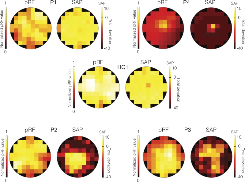
Figure 3.
Total deviation SAP and modified pRF visual field coverage maps for the left eye data from all patients and a representative HC (HC1). In each case, the modified pRF visual field coverage maps are displayed as heat maps to the left. These visual field coverage maps have been normalized to the maximum value within the modified visual field coverage map of HC1. Positions in the visual field with higher pRF values are color-coded as yellow/white, with positions in the visual field with lower pRF values color-coded as red/black. The right-hand plot in each case depicts the total deviation SAP measurements as heat maps. In these plots, bright cells (yellow/white) represent locations in the visual field with sensitivity either equal to or greater than normal age-matched controls, whereas dark-colors (red/maroon) represent locations in the visual field with decreased sensitivity relative to a normal age-matched control. The black-line on the color bar represents the same sensitivity as a normal age-matched control. Thus, bright yellow/white cells indicate increased sensitivity and orange/red/maroon cells indicate decreased sensitivity.

