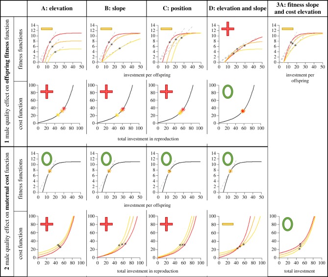
Figure 1.
Overview of all basic scenarios presented. Upper rows (row 1 and row 3) of plots show offspring fitness functions in the different scenarios, and lower rows (row 2 and row 4) shows cost functions in the same scenarios. Note that the cost function is the same in all scenarios when the male affects the offspring fitness function, and likewise the offspring fitness function is the same in all scenarios when the male affects the maternal cost function. The red (darker) lines always represent the high-quality male, while the orange and yellow (lighter) lines represent the medium- and low-quality males, respectively. The grey dashed lines in the fitness functions represent the tangent from the origin to each of the fitness functions, and in all cases represented in this figure, they hit the fitness function in the same place as where the optimal per-offspring investment is found (represented by a star). The red ‘+’, yellow ‘–’ and green ‘0’ signs placed in each panel indicate whether the predicted DA is positive, negative or not present (colours correspond to the male quality receiving the highest investment). In the top row, it is the investment per offspring DA (i.e. offspring size) that is represented, while in the bottom row, these signs indicate DA in total investment. This can also be seen by comparing where on the x-axis the stars indicating the optimal investments for each male quality falls, and when the red star is left of the yellow star investments will be higher for low-quality males. (Online version in colour.)

