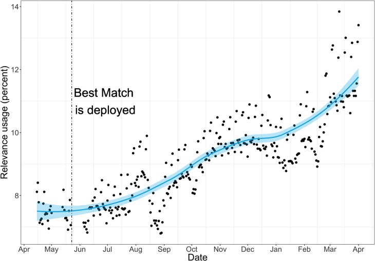
Fig 3. Usage rate of relevance sort order over 6 months (May 2017 to October 2017).
The blue line represents the trend, and the blue area represents the variance. The vertical line denotes the switch to the new relevance algorithm, Best Match, which is followed by a significant and steady increase in usage. Note that the 1% usage rate on the y-axis represents about 30,000 queries on an average work day.

