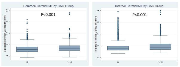
Fig. 2.
Box plots representing the CCA-IMT and ICA-IMT measurements for groups with different CAC scores.
The upper edge of the box indicates the 75th percentile, the lower edge indicates the 25th percentile and the middle line indicates the 50th percentile; whiskers (lines extending from the box top and bottom) indicate the highest and the lowest values that are not outliers or extreme values, and circles represent outliers.

