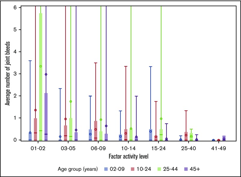
Figure 2.
Distribution of average number of joint bleeds across factor activity level by age groups for patients with hemophilia B. In the boxplots, the central rectangle spans the first quartile to the third quartile, a horizontal line inside the rectangle shows the median, and a circle shows the mean. Vertical lines that extend to the top of the graph indicate the presence of outlier values above 6 joint bleeds per 6-month period.

