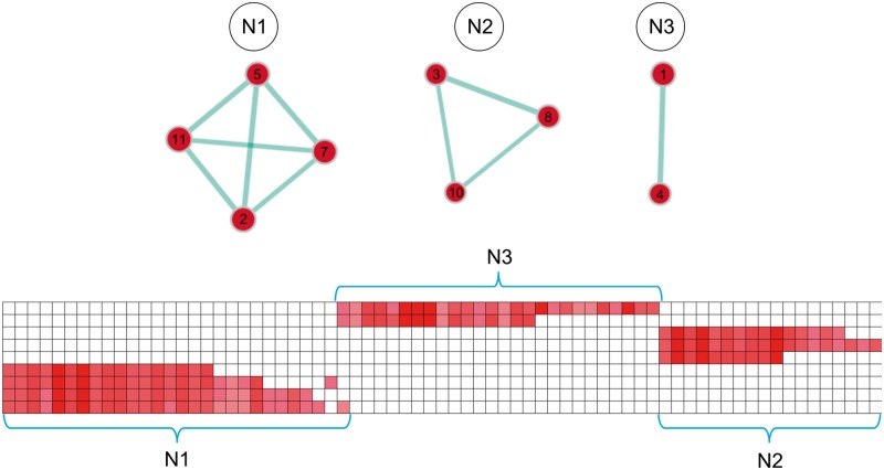
Figure 4.
Network structure of positively enriched gene sets in neurodegeneration-vulnerable brain regions. Positively enriched gene sets (red circles) are plotted in a graph structure, where the overlap in gene members between different gene sets is indicated by the width of cyan lines. Gene sets are numbered according to their order in Table 3 and circle diameters reflect the size of each gene set. The matrix plot below shows the cluster structure of the leading-edge genes of the enriched gene sets (hierarchical clustering with average linkage). Each column corresponds to a leading-edge gene as detailed in Supplementary Table 2. Rows 1 and 2 contain the leading-edge genes of gene sets in cluster N3, rows 3–5 those of gene sets in cluster N2, and rows 6–10 those of gene sets in cluster N1.

