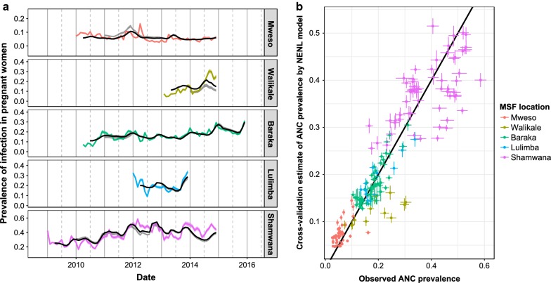
Fig. 6.
The results of the out-of-sample prediction for the best fitting “NENL” model. This uses at least one previous year of data as a training dataset before trying to make out-of-sample predictions for the subsequent years. a The coloured lines show the observed ANC prevalence each month at each location and their corresponding 95% confidence interval. The black line shows the model predictions of the ANC prevalence when the model was fit using all data. The grey band shows a 95% confidence interval for the rolling origin cross validation technique. b Points show a comparison of observed ANC prevalence and the corresponding out-of-sample predictions, coloured by site. Lines around the points show the 95% confidence interval for the observations and out-of-sample prediction. The black line shows a perfect correspondence between observation and prediction

