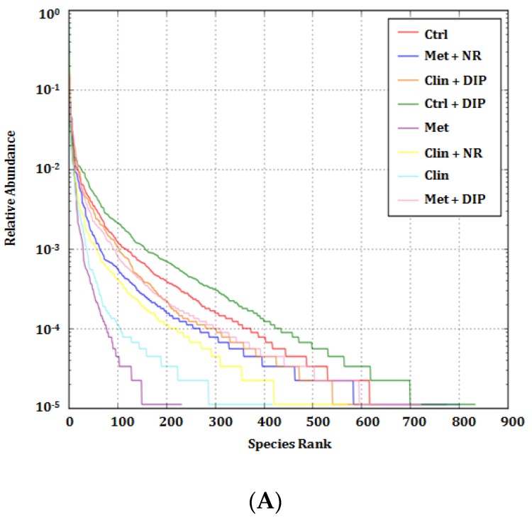
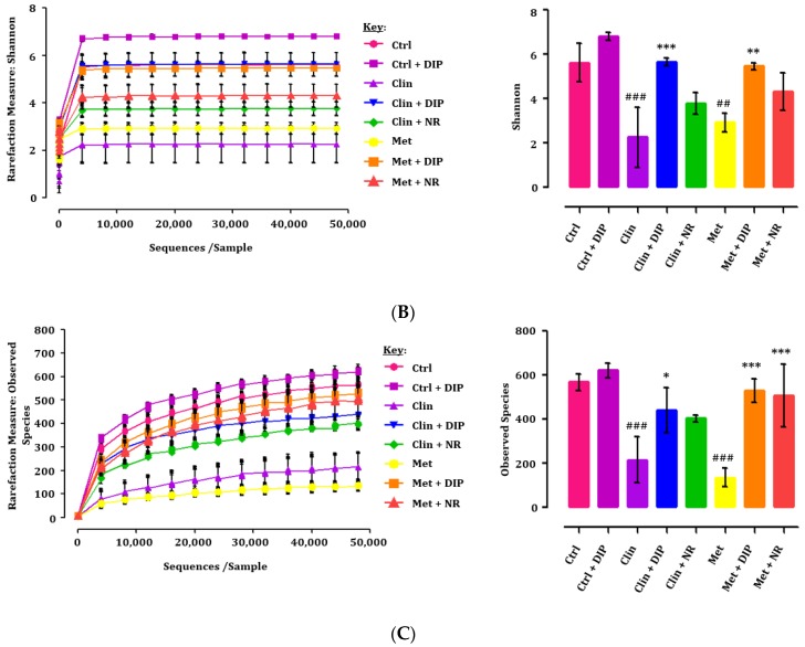
Figure 3.
Rank abundance and rarefaction curves. (A) Rank abundance curve depicting the species richness and evenness. The x- and y-axis indicates the number of operational taxonomic units (OTUs) according to the relative abundance and species evenness respectively. The higher the species richness, the larger the curve on the x-axis will be, and the smoother the curve, the more even the species distribution will be. (B) Rarefaction curves representing species abundance and diversity. Left: Shannon index value showing the microbial diversity and richness for each treatment group. Right: bar graph of the Shannon index values at maximum OTUs, where ## p < 0.01 and ### p < 0.001 compared to the control group (Ctrl), and ** p < 0.01 and *** p < 0.001, compared to the antibiotic-treated groups (Clin/Met), evaluated by using one-way analysis of variance (ANOVA) followed by Tukey’s multiple comparison test. Bar graph depicting mean ± standard error of mean (SEM) (n = 3); (C) Observed species depicting species diversity and evenness. Left: observed species showing the microbial diversity and richness for each treatment. The x-axis shows the number of valid sequences per sample and the y-axis shows the observed species (OTUs). Each curve in the graph represents a different group and is shown in a different color. Right: bar graph of the observed species at maximum OTUs, ### p < 0.001 compared to the control group (Ctrl), and * p < 0.05 and *** p < 0.001 compared to the antibiotic-treated groups (Clin/Met), evaluated by using one-way analysis of variance (ANOVA) followed by Tukey’s multiple comparison test. Data presented here is the mean ± standard error of mean (SEM) (n = 3).


