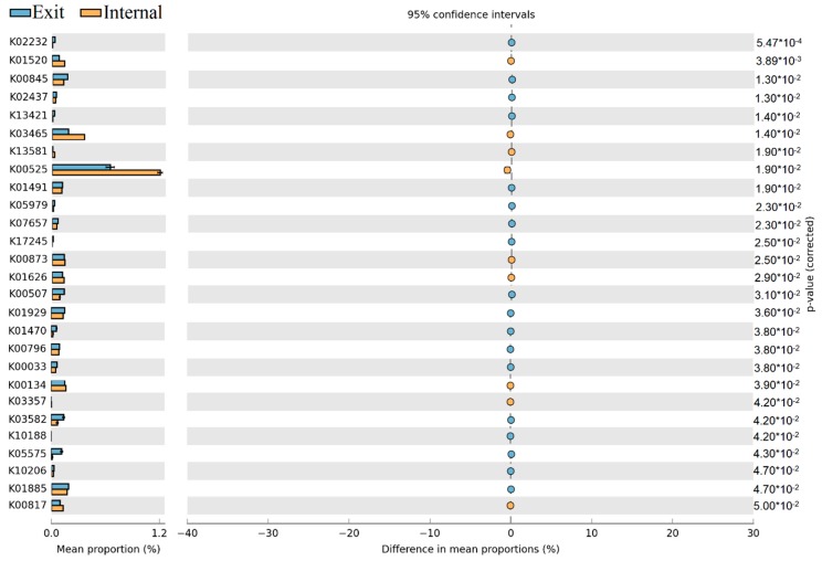
Figure 9.
Proportion differences analysis of KEGG functional categories between internal and exit sites are represented in an extended error plot (the top 80 abundant KEGG functional categories were selected for analysis). Total mean proportions (%) in the KEGG categories are exhibited by the bar graph (left column); the upper bar graph (blue) represents the samples at the exit site, whereas the other bar graph (yellow) represents the samples at the internal site in each category. The coloured circles corresponding to the (right column) (blue and yellow) represent 95% confidence intervals calculated by Welch’s t-test. KEGG functional categories were filtered by p-value (0.05) and effect size (0.04).

