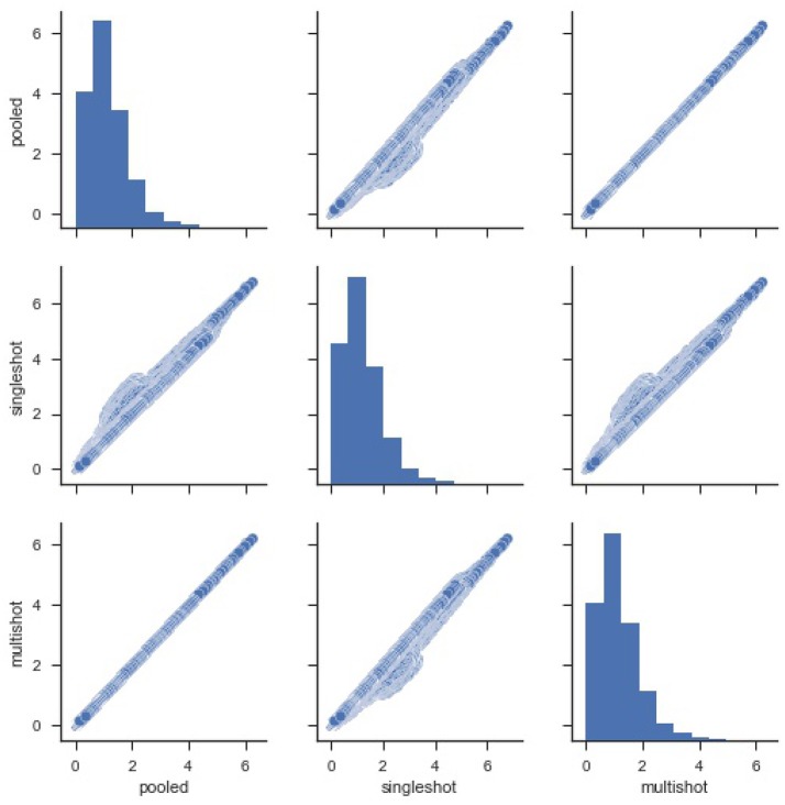
Figure 1.
Pairwise plot of Sum Square of Errors (SSE) from pooled, single-shot and multi-shot regression. Although the distribution plot looks similar across the three regressions, the pooled regression vs. multi-shot regression scatter plot demonstrates how identical they are to each other.The scatter plot of pooled regression vs. single-shot regression demonstrates that the SSE values obtained from singles-shot regression are on the higher side compared to the values from pooled regression.

