
FIGURE 2.
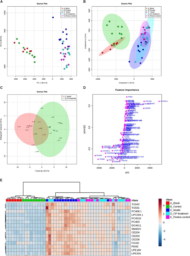
The lipidomics study on serum from diabetic mice: Metabolic profiles and multivariate data analysis. (A) PCA score plot of the blank group (red color), control group (green color), model group (dark blue), CP group (light blue), and positive group (purple). (B) PLS-DA score plot with 95% confidence interval of all studied groups. (C,D) OPLS-DA score plot and S-plot between model group and CP treatment group. (E) Heatmap of selected metabolites was built based on one-way ANOVA rankings and hierarchical clustering. Each dot represents one mouse.