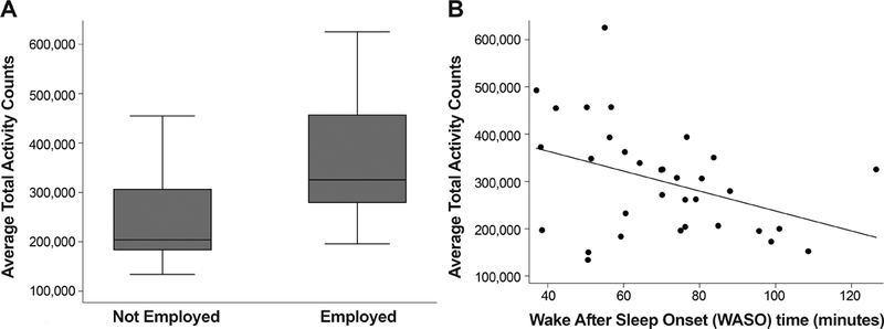
Figure 1.

Box plot of (A) average total activity counts measured with actigraphy for subjects who were employed/student versus not employed/student (p=0.0035). A scatterplot shows the significant relationship between (B) average total activity counts measured with actigraphy versus wake after sleep onset (sleep disruptions); the drawn line represents a linear regression line (p=0.025). In the box plot, the bottom and top of the box are the 25th and 75th percentile (i.e. the upper and lower quartiles, respectively) and the band near the middle of the box is the 50th percentile (i.e. the median). The ends of the whiskers represent the lowest datum within 1.5 times the interquartile range of the lower quartile, and the highest datum still within 1.5 times the interquartile range of the upper quartile.
