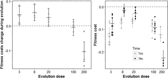
Figure 5. Evolution of the costs of resistance across Nal doses.

Evolution of the costs of resistance across Nal doses. Bars represent means ± SD among lines evolved at the same dose. Dots are mean values of fitness change (left panel) or selection coefficient (right panel) for each different gyrA line while stars indicate the non‐gyrA lines. On the right panel, mean selection coefficients are plotted after the screen (in grey) and after the 400 generations of evolution in antibiotic (in black) in the corresponding evolution dose. On the left panel, we see that the fitness costs are reduced when evolving at low doses, but that they increase when evolving at high dose. On the right, we see that fitness costs are globally larger at high evolution dose, but also that non‐gyrA mutant at the lowest dose exhibit a very strong cost.
