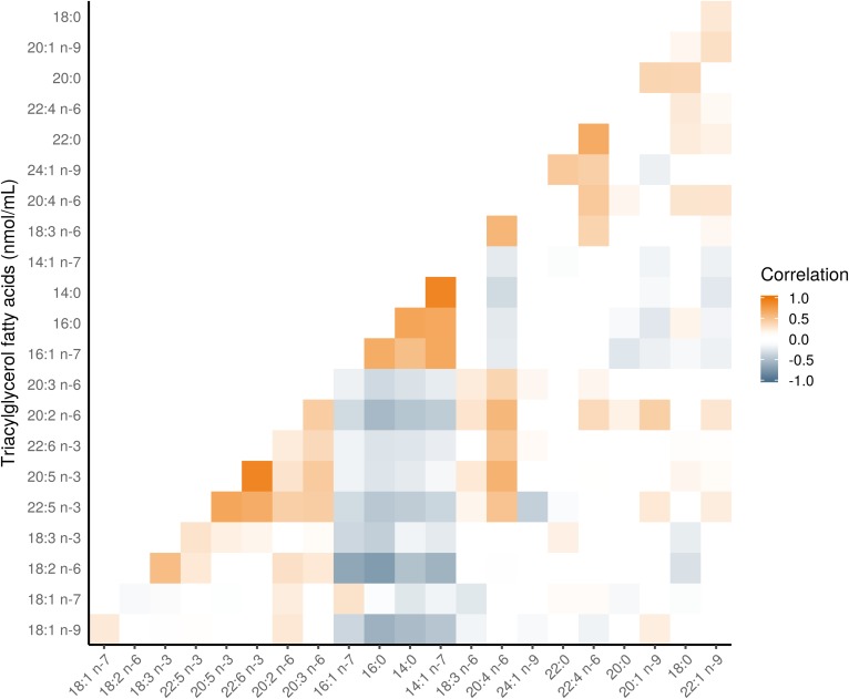
Fig. 4.
Pearson correlation heatmap of TGFAs in the PROMISE participants from the baseline visit (2004–2006). The correlations of FAs grouped using hierarchical cluster analysis; FA along the x and y axes are ordered according to this analysis. Darker orange represents a positive correlation; darker blue represents a negative correlation.

