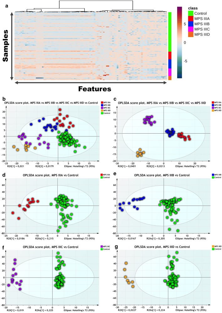
Fig. 2.
a Hierarchical cluster analysis and heat map visualization of top 100 variables (x-axis) ranked by ANOVA. The urine sample classes are represented along the y-axis. The color code was used to represent log-scaled intensities of features between − 5 (blue) and + 5 (brown), showing the relative abundance of the features according to the groups. b OPLSDA scores plot (R2 = 0.77, Q2 = 0.13) shows a clear separation between the different diseased and control groups (MPSIIIA, MPSIIIB, MPSIIIC and MPSIIID and control). c OPLSDA scores plot (R2 = 0.93, Q2 = 0.05) shows a clear separation between the different diseased groups (MPSIIIA, MPSIIIB, MPSIIIC and MPSIIIC). d Clear separation between MPSIIIA and control samples is observed (R2 = 0.89, Q2 = 0.23). e Clear separation of MPSIIIB samples from the controls is observed (R2 = 0.89, Q2 = 0.21). f Clear separation of MPSIIIC samples from the controls is observed (R2 = 0.98, Q2 = 0.39). g Clear separation of MPSIIID samples from the controls is observed (R2 = 0.95, Q2 = 0.36). Detailed model characteristics and validation are given in Additional file 1

