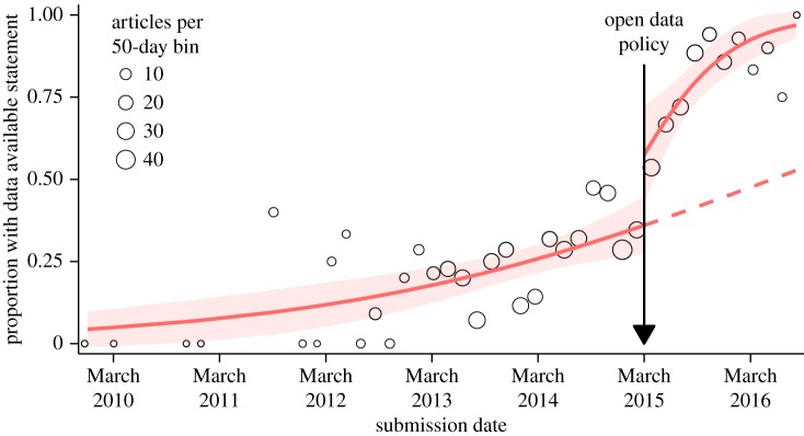
Figure 1.
Proportion of articles with data available statements as a function of submission date across the assessment period. For ease of presentation, circles indicate proportions in 50-day bins with the circle area representing the total number of articles in each bin (but note that the analysis model was fitted to individual articles). Solid red lines represent predictions of an interrupted time-series analysis segmented by pre-policy and post-policy periods. The dashed red line estimates, based on the pre-policy period, the trajectory of data available statement inclusion if the policy had no effect. The model is linear on the logit scale, whereas the y-axis of the figure is on the probability scale, which is a nonlinear transformation of the logit. Confidence bands (red) indicate 95% CIs. Note that the small article numbers in the extremes of the graph are due to long submission-to-publication lag times. Our sample selection was based on the publication date, but it is the submission date which determines whether an article falls within the pre-policy or post-policy period.

