
Figure 7.
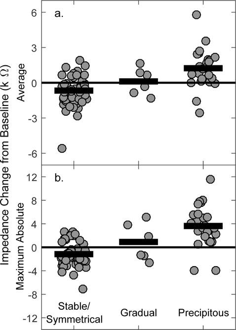
Average (a) and maximum (b) impedance changes across time separated by hearing loss category. Note the different y scales. Individual data are represented with gray circles, and group means with horizontal black bars.
Official websites use .gov
A
.gov website belongs to an official
government organization in the United States.
Secure .gov websites use HTTPS
A lock (
) or https:// means you've safely
connected to the .gov website. Share sensitive
information only on official, secure websites.
Average (a) and maximum (b) impedance changes across time separated by hearing loss category. Note the different y scales. Individual data are represented with gray circles, and group means with horizontal black bars.