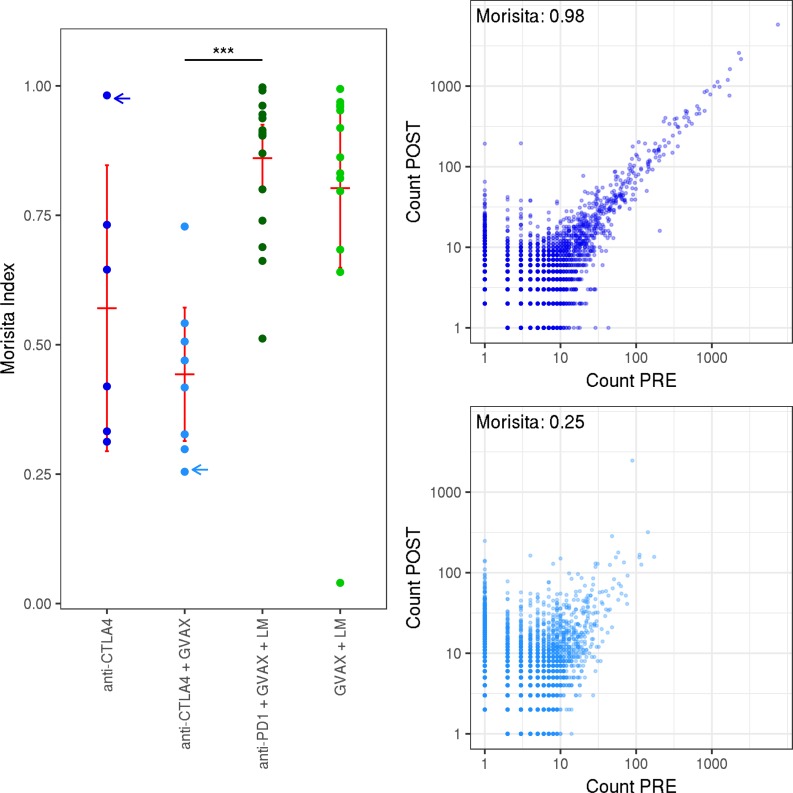
Figure 2. Overlap between pre- and posttreatment samples.
Left: the Morisita distance between pre- and posttreatment; 3 samples for each patient. Patients are separated by treatment arm. Right: scatter plots showing the abundance of each clone before and after treatment, from 2 representative patients with low (bottom) and high (top) Morisita index. Blue arrows indicate which repertoires are shown to the right. Red bars represent mean and 95% CI. A Wilcoxon signed-rank test was used to assess significance. ***P < 0.00005.

