
Figure 1.
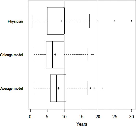
Boxplot display of life expectancy (LE) predictions by patients, physicians, and prognostic models. Boxplot displays the median (bold vertical line), interquartile range (IQR; solid line box), 1.5 IQR adjacent values (whiskers), outliers (points), and the mean value (+) for LE predictions by physicians (“How many years do you estimate that this patient will live?”), the Chicago model, and the Average model (mean of physician’s LE prediction and LE output of Chicago model).