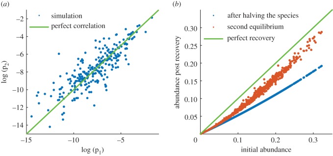
Figure 2.
Repeated simulations and perturbations. (a) A scatter plot of the log probabilities of species abundances across two independent runs of the model. (b) Simulation of how the population reacts to perturbations after reaching an equilibrium. The blue points plot the prevalence of a species after its numbers were halved against its initial prevalence. The red points show population recovery after a new equilibrium has been reached. Green line shows hypothetical perfect recovery.

