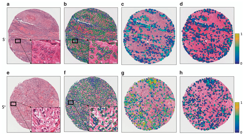
Figure 2.
Quantitative histomorphometry feature map illustration. The first column (a, e) shows H&E-stained images of tumors from S− (no disease-specific death) and S+ (disease-specific death) groups. The segmented nuclei contours (shown with green boundaries) are shown in the second column (b, f) with cell cluster graphs. The lines represent connecting edges between nuclei. The third (c, g) and fourth (d, h) columns show quantitative histomorphometric features that capture the variance in nuclear texture and shape, respectively. The blue and yellow colors represent low and high feature values. The S+ case shows a larger range of values than the S− case.

