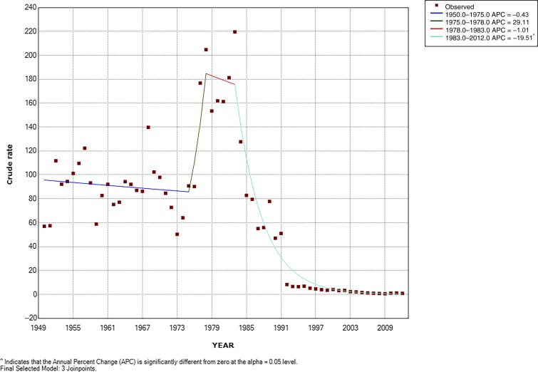
Figure 2.
Typhoid fever (TF) incidence trend in the metropolitan region of Chile Joinpoint regression 1950–2012. Best joinpoint model. ^ indicates that the average percent change (APC) is significantly different from zero at alpha = 0.05 level. The squares represent the observed rates per 100,000 persons of TF across the study period (1950–2012). The dark blue line is the joinpoint model from 1950 to 1975. The dark green line is the joinpoint model from 1975 to 1978. The red line shows the joinpoint model from 1978 to 1983. The turquoise line shows the joinpoint model from 1983 to 2012. Note: The joinpoint model is a Poisson model that, unlike the interrupted time series, does not incorporate level changes and only changes in the slope. It looks for points where the slope breaks. To estimate a slope, it requires at least two intermediate points between breakpoints.

