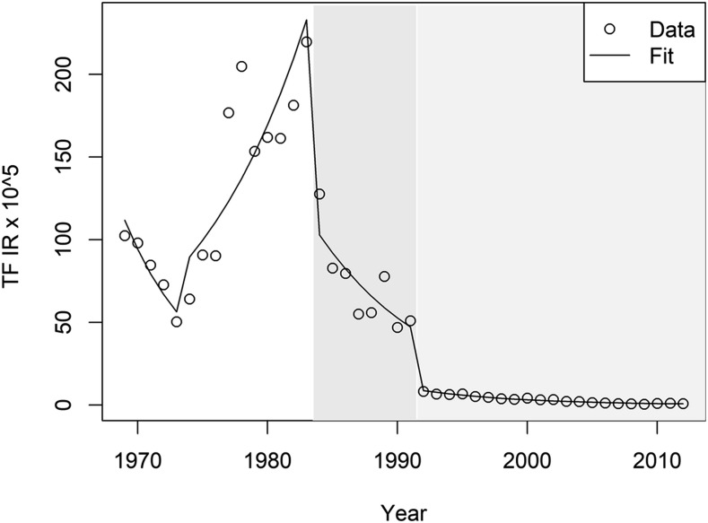
Figure 3.
Typhoid fever (TF) observed incidence rates (IRs) in the metropolitan region and interrupted time series model fit. Typhoid fever observed IRs per 100,000 persons between 1969 and 2010 are shown with the open circles. Predicted TF IRs within the same time period per 100, 000 persons is shown as a line of best fit. Gray bands represent the area of effect of each intervention. The darkest band represents Intervention 1.

